O
Hi!
OOOOOOOOO
I'm Benoit Brun, from Sanary-sur-Mer. (FR)
I am a graphic designer graduated from ECAL/Ecole Cantonale d'art de Lausanne. (CH)
Journal, INFORMATIONS, CONTACT .
O
N°
Title
Category
Date
S
01/11
Info. →
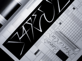
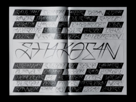
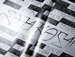
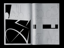
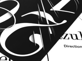
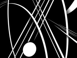
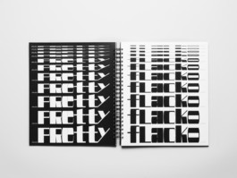
SHAKOTAN
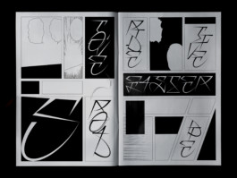
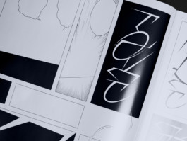
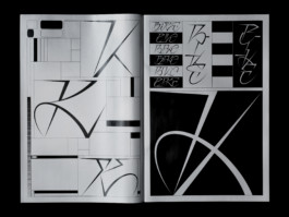
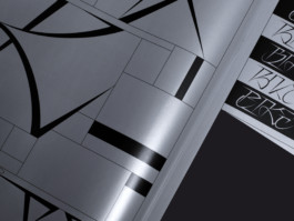
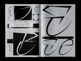
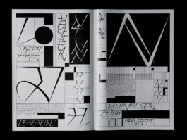
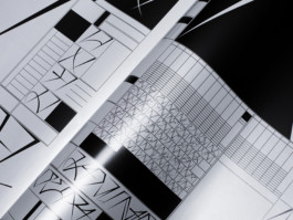
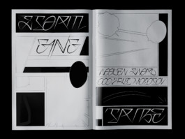
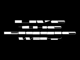
Shakotan is a lettering inspired by the japanese tuning. I used shapes inspired by curves from tuned cars, ornaments, stickers.
It suggests motion and fastness. It’s a versatile lettering, with multiple possible variations for the same letter.
● Specimen, 315×470mm, 20 pages
● Supervised by Gilles Gavillet, Nicole Udry
● Offset, Black & Silver, 200copies, Printed at Cavin
O
02/11
Info. →
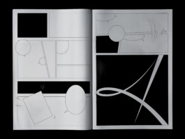
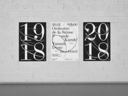
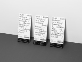
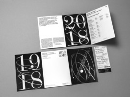
OSR
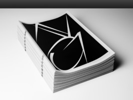
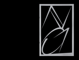
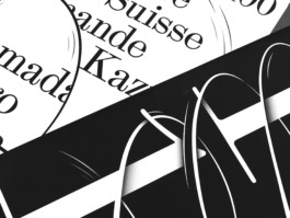
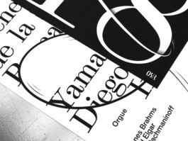
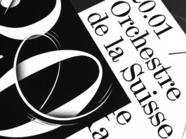
Visual identity made for the centenary of the Roman Swiss Orchestra.
This project transcribes music motion: the harmonics between different instrument chord. This universe is inspired by the world of comic books, childish and innocent confronted to the prestigious and strict sides of classical music.
● Flyers, Tickets & 3 posters (F4)
● Supervised by Diego Bontognali, Guy Meldem, Nicole Udry
● Printed at ECAL
O
03/11
Info. →
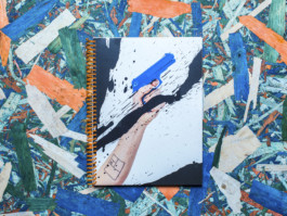
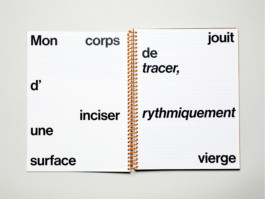
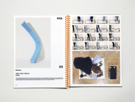
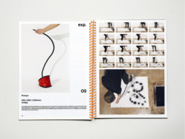
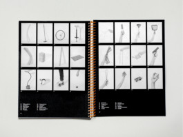
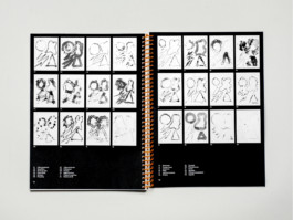
ACTION WRITING
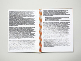
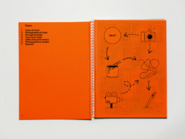
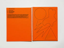
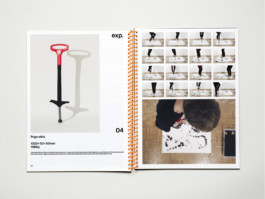
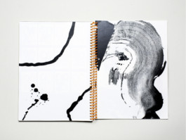
I questionned myself about the implication of the body in the act of writing, about the relationship that body and tool maintain. When we are constrained by the tool, writing appears like a moment of pulsional and unreflected existence.
From my point of view, writing is a testimony of the living body in action and composition in the instant.
● Memoir, 230×310mm, 94 pages and a teaser video
● Supervised by Alexandru Balgiu
● Printed at ECAL
04/11
Info. →
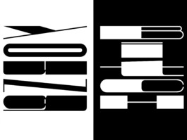
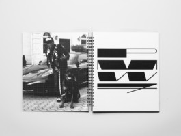
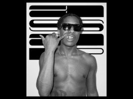
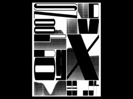
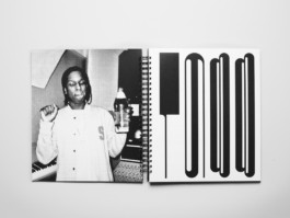
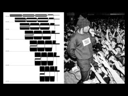
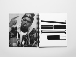
A$AP, TYPEFACE
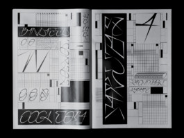
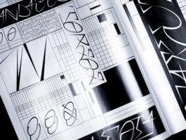
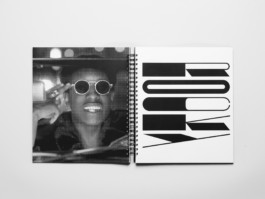
ASAP is a display typeface inspired by Hip-Hop culture.
I decided to work the letter like a graffiti and explore the limit of visibility and readability. ASAP overcomes the classic codes by thinking of a typography that is to read more in its verticality than in its horizontality.
● Book, 280×330mm, 116 pages and posters
● Supervised by Ian Party (SwissTypefaces)
● Printed at ECAL
05/11
Info. →
PRINT & SERIGRAPHY
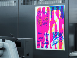
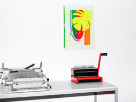
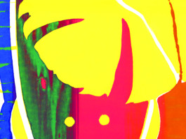
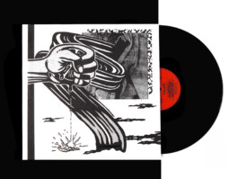
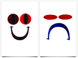
This is some projects realized with analog techniques and print experimentations.
This is the result of a week-long screenprint workshop run by Ronny Hunger, Michiel Schuurman or personal works.
● Posters & cover for vinyle
● Workshop with Ronny Hunger, Michiel Schuurman
● Printed at ECAL
O
06/11
Info. →
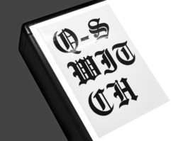
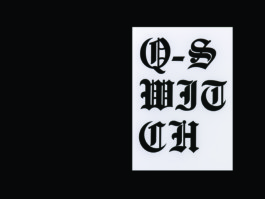
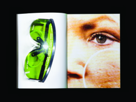
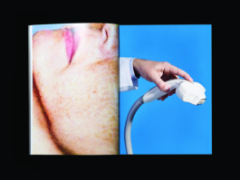
Q—SWITCH
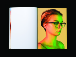
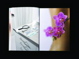
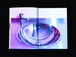
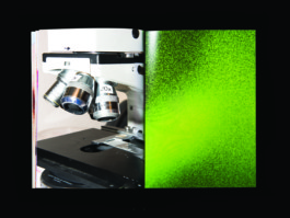
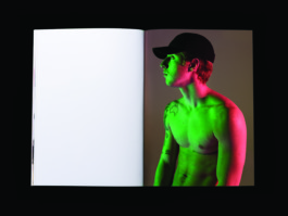
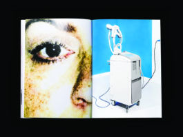
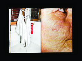
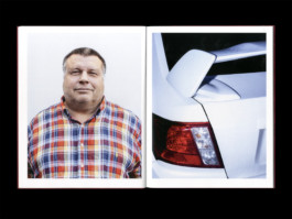
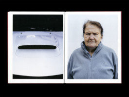
Photobook about Tattoo Removal in collaboration with The Cool Blondes Gang / Melina Lilienfeldt-Karstner & Alexander Scholle
● Book, 230×320mm, 48 pages
● Supervised by François Rappo & Anouk Schneider
● Printed at ECAL
07/11
Info. →
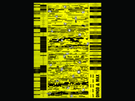
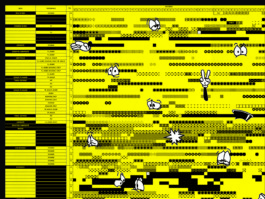
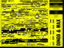
DINGO & MAX
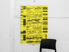
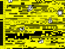
I analyzed the emotions of the two main characters in the road movie « Dingo & Max ».
I used these significant datas in order to create a poster that interprets them into a graphical map.
● Posters, 598×841mm
● Supervised by Angelo Benedetto
● Printed at ECAL
O
08/11
Info. →
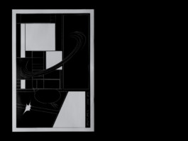
D'UNE MEME VOIX
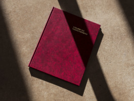
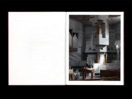
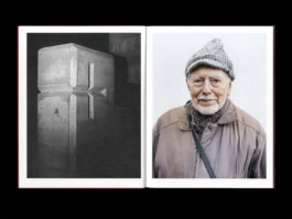
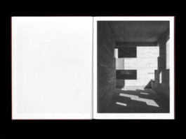
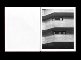
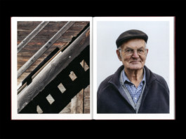
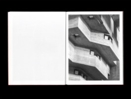
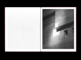
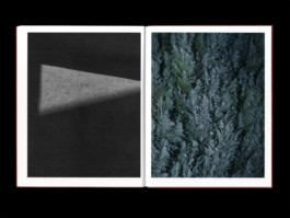
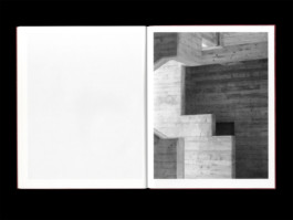
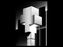
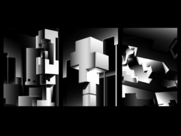
This is a photobook about the parish of Hérémence. It enlightens the contrast between a warm wooden town and its frigid, suprematist church.
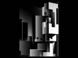
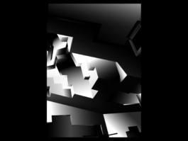
The three illustrations that come with the edition reinforce the light games of the high-contrasted church.
● Photography by myself
● Book, 200×255mm, 54 pages
● Supervised by Nicole Udry
● Printed at IComme, Binding by Mélanie Humair
09/11
Info. →
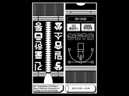
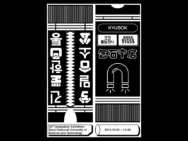
SEOUL UNIVERSITY
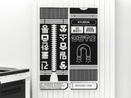
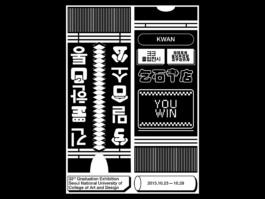
This is a declination of posters for the Graduation Exhibition of Seoul National University of Science & Technology Visual Communication Design.
● Posters (A0)
● Supervised by Jonas Wandeler
● Printed at ECAL
10/11
Info. →
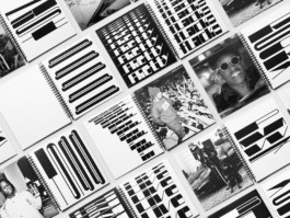
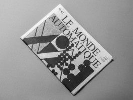
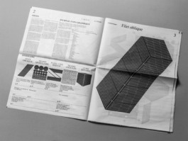
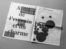
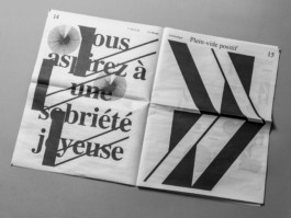
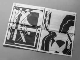
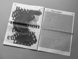
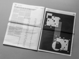
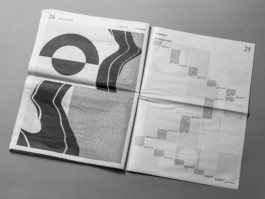
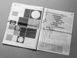
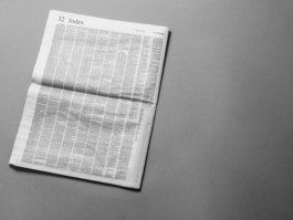
LE MONDE AUTOMATIQUE
The project is the result of a workshop (5days) with the second year students at ECAL.
We worked on an alternative Typo-Graphic newspaper inspired by automatic writing, born in the surrealism movement lead by André Breton, and concrete poetry. A part of the group designed the layout while the other developed some visual typefaces.
● Newspaper, 375×529mm, 32 pages
● Workshop with Ludovic Balland
● Printed at Newspaper Club
11/11
Info. →
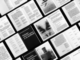
PATH LAB
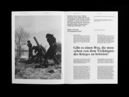
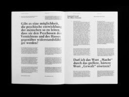
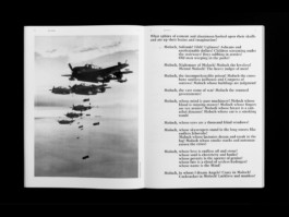
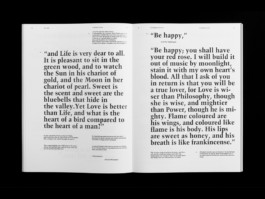
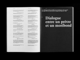
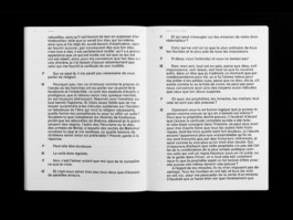
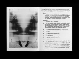
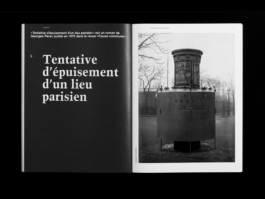
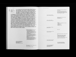
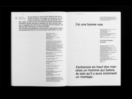
The main goal of this book is to offer the reading of 5 literary texts in english, french, german next to their translation in french.
● Book, 235×320mm, 96 pages
● Supervised by Harry Bloch
● Printed at ECAL
All right reserved Benoit Brun
© 2017
GO UP!
OOOOOOOOO
I'm Benoit Brun, from Sanary-sur-Mer. (FR)
I am a graphic designer graduated from ECAL/Ecole Cantonale d'art de Lausanne. (CH)
Journal, INFORMATIONS, CONTACT .
O
01/11
Info. →
SHAKOTAN
Shakotan is a lettering inspired by the japanese tuning. I used shapes inspired by curves from tuned cars, ornaments, stickers.
It suggests motion and fastness. It’s a versatile lettering, with multiple possible variations for the same letter.
● Specimen, 315×470mm, 20 pages
● Supervised by Gilles Gavillet, Nicole Udry
● Offset, Black & Silver, 200copies, Printed at Cavin
O
O
02/11
Info. →
OSR
Visual identity made for the centenary of the Roman Swiss Orchestra.
This project transcribes music motion: the harmonics between different instrument chord. This universe is inspired by the world of comic books, childish and innocent confronted to the prestigious and strict sides of classical music.
● Flyers, Tickets & 3 posters (F4)
● Supervised by Diego Bontognali, Guy Meldem, Nicole Udry
● Printed at ECAL
O
O
03/11
Info. →
ACTION WRITING
I questionned myself about the implication of the body in the act of writing, about the relationship that body and tool maintain. When we are constrained by the tool, writing appears like a moment of pulsional and unreflected existence.
From my point of view, writing is a testimony of the living body in action and composition in the instant.
● Memoir, 230×310mm, 94 pages and a teaser video
● Supervised by Alexandru Balgiu
● Printed at ECAL
O
O
04/11
Info. →
A$AP, TYPEFACE
ASAP is a display typeface inspired by Hip-Hop culture.
I decided to work the letter like a graffiti and explore the limit of visibility and readability. ASAP overcomes the classic codes by thinking of a typography that is to read more in its verticality than in its horizontality.
● Book, 280×330mm, 116 pages and posters
● Supervised by Ian Party (SwissTypefaces)
● Printed at ECAL
O
O
05/11
Info. →
PRINT & SERIGRAPHY
This is some projects realized with analog techniques and print experimentations.
This is the result of a week-long screenprint workshop run by Ronny Hunger, Michiel Schuurman or personal works.
● Posters & cover for vinyle
● Workshop with Ronny Hunger, Michiel Schuurman
● Printed at ECAL
O
O
06/11
Info. →
Q—SWITCH
Photobook about Tattoo Removal in collaboration with The Cool Blondes Gang / Melina Lilienfeldt-Karstner & Alexander Scholle
● Book, 230×320mm, 48 pages
● Supervised by François Rappo & Anouk Schneider
● Printed at ECAL
O
O
07/11
Info. →
DINGO & MAX
I analyzed the emotions of the two main characters in the road movie « Dingo & Max ».
I used these significant datas in order to create a poster that interprets them into a graphical map.
● Posters, 598×841mm
● Supervised by Angelo Benedetto
● Printed at ECAL
O
O
08/11
Info. →
D'UNE MEME VOIX
This is a photobook about the parish of Hérémence. It enlightens the contrast between a warm wooden town and its frigid, suprematist church.
The three illustrations that come with the edition reinforce the light games of the high-contrasted church.
● Photography by myself
● Book, 200×255mm, 54 pages
● Supervised by Nicole Udry
● Printed at IComme, Binding by Mélanie Humair
O
O
09/11
Info. →
SEOUL UNIVERSITY
This is a declination of posters for the Graduation Exhibition of Seoul National University of Science & Technology Visual Communication Design.
● Posters (A0)
● Supervised by Jonas Wandeler
● Printed at ECAL
O
O
10/11
Info. →
LE MONDE AUTOMATIQUE
The project is the result of a workshop (5days) with the second year students at ECAL.
We worked on an alternative Typo-Graphic newspaper inspired by automatic writing, born in the surrealism movement lead by André Breton, and concrete poetry. A part of the group designed the layout while the other developed some visual typefaces.
● Newspaper, 375×529mm, 32 pages
● Workshop with Ludovic Balland
● Printed at Newspaper Club
O
O
11/11
Info. →
PATH LAB
The main goal of this book is to offer the reading of 5 literary texts in english, french, german next to their translation in french.
● Book, 235×320mm, 96 pages
● Supervised by Harry Bloch
● Printed at ECAL
O
All right reserved Benoit Brun
© 2017
GO UP!
