Hi!
I'm Benoit Brun, from Sanary-sur-Mer. (FR)
I am a graphic and type designer graduated from ECAL/Ecole Cantonale d'art de Lausanne. (CH)
Instagram, INFORMATIONS, CONTACT .
Number
Title
Category
Date
01/16
Info.
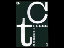
Karak
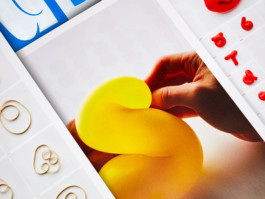
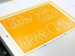
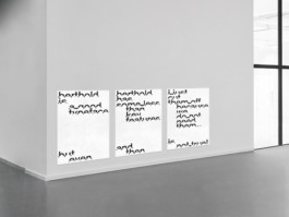
“I got a paper sheet, here are the scissors, let’s see how to make an ‘a.’
Okay, here we go! Let’s cut first into the sheet, there is no turning back now! It’s like a choreography. I draw a curve, then I turn my sheet and I go backwards... Wooah a shape and counter-shape game appears as if I am creating the Yin and Yang sign. Well, let’s carry on under the sound of ‘snip-snip’ until I reach my first cut. Mhm in the end this ‘a’ looks like a fat guy who leans forward and looks at his belly…”
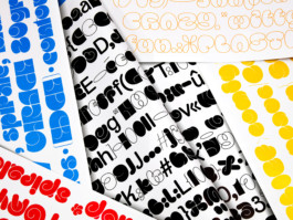
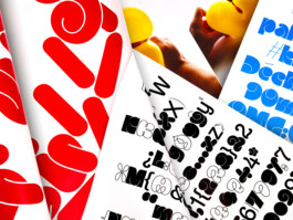
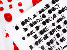
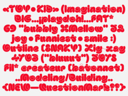
Karak is a typeface composed of 5 styles, which are the result of an original material experimentation. This is a journey that recalls the innocence and the creative impulse of our youth days.
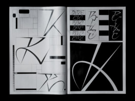
● Specimen, 460*650 mm
● Printed in UV at SwissGrafik
02/16
Info.
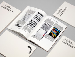
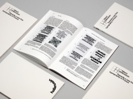
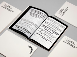
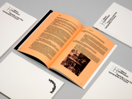
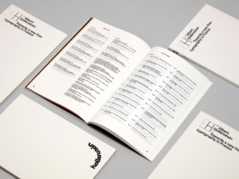
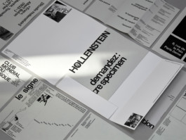
A. Hollenstein, Towards a new free typography in France
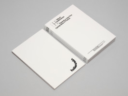
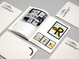
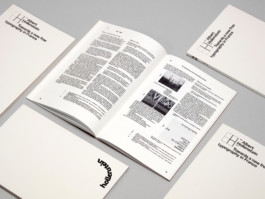
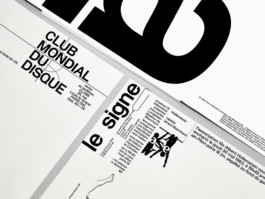
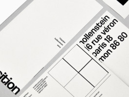
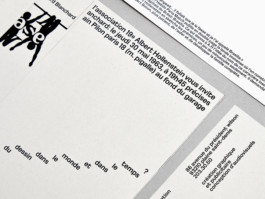
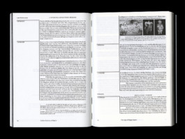
Perceived as “French” in Switzerland and “Swiss” in France, the career of Albert Hollenstein as a typographer was the subject of my MA thesis. I aimed to show his entire path and typographic work. An art, which according to him, is capable of accompanying all social and cultural changes because it gives us the opportunity to decipher the world.
Through this writing, I came to think that Hollenstein’s adventure could be seen as an example to be remembered, to be highlighted for all the future generation of today’s graphic designers. Indeed Hollenstein dedicated his life (from the 50 to the early 70’s) to research new innovations and promote a new typography in France considered as free, imaginative, exclusive and ever more original. By constantly recruiting new collaborators – as young typographers and unknown graphic designers – Hollenstein’s team was on top of the French phototitling scene in the 70’s.
●Book, 98p., 180*270 mm
● Printed at ECAL
03/16
Info.
Neue Brasilia
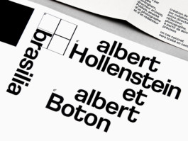
After going through Albert Hollenstein’s archive and doing many researches on his life, I finally decided to make my own interpretation of the wonderful and iconic “Brasilia,” initially thought and sketched by Hollenstein and then designed and developed by his friend Albert Boton.
● Several formats and mediums
● Printed at ECAL
04/16
Info.
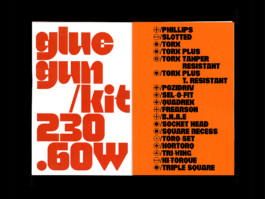
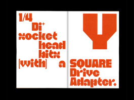
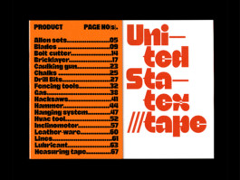
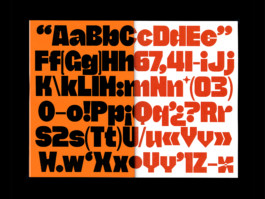
OBY
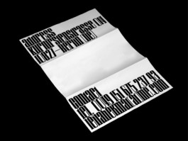
“OBY” is a font inspired by the univers of the Tools. It has two cuts: a strong one display version characterized by geometric elements similar to the shape of some tools and a more classic one which can be used more for “texts”.
● Specimen, 212*318 mm
● Printed at ECAL
05/16
Info.
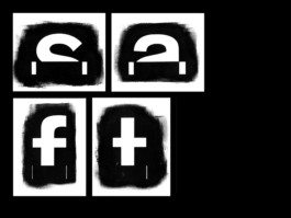
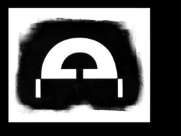
Stencil
During a workshop lead by NORM, I spent four days working on the topic of a stencil typeface. It results in three posters produced only by hand.
● Handmade posters (F4)
● Workshop with NORM
06/16
Info.
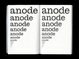
Tikgo
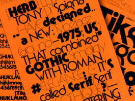
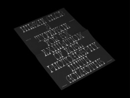
Herb Lubalin and Tony Di Spigna have designed a new typeface around 1975 for Photo. Lettering INC. that combined Gothic simplicity and Roman elegance; they called it “Serif Gothic.”
Tikgo is a reinterpretation of this iconic model which distinguishes itself by the accentuation and affirmation of its geometric properties. It exists in several cuts starting from a light – very thin with detailed and powerful serifs – to an extreme and impacting black cut. This rather modern and digital version that is “Tikgo” also offers a new reworked and extremely tighter spacing than the original.
● Poster, A0 (841*1189 mm)
● Specimen’s flyer, A4 (210*297 mm)
● Printed at ECAL
07/16
Info.
Rapid
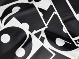
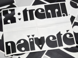
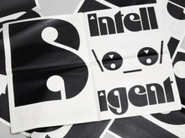
This project is the result of a collaboration with Raphaël de la Morinerie, also graphic and type designer. We designed this typeface based on the logo of the industrial machinery firm “Rapid.”
Then we discovered that it was a forgotten typeface called “Bau” designed by Flemming Bau in 1973 and published by Mecanorma foundry the same year. Both “Bau” and “Rapid” design systems are based on a four-circle grid but do not share the same lettershape constructions.
● Newspaper, 350*500 mm
● Printed at Newspaper Club
08/16
Info.
Craft
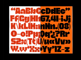
“Craft” is a collaborative display typeface that takes shape within the framework of a visual identity proposal for a Berlin artist.
In her moodboard she shared with us her taste for wooden headline typefaces. We then attempt to grasp the essence of this typographic style by digitally working on their characteristic, which is both brutal and subtly naïve.
This project is also the result of a collaboration with Raphaël de la Morinerie.
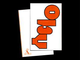
● Letterhead, 210*297 mm
● Exhibition’s flyer, 148*210 mm
● Business card, 55*90 mm
09/16
Info.
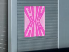
Mirage Club
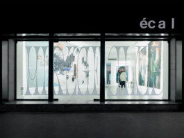
Mirage Club is a special lettering and a display typeface I developped for the ecal Show, result of a workshop led by Golgotha. The lettering was exhibited on the gallery window at 24 rue Beaubourg during ParisPhoto.
● Exhibition display for the ECAL show
● Flyer, 148*210 mm
10/16
Info.
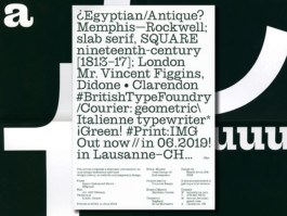
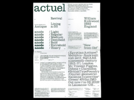
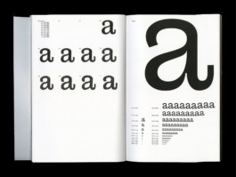
Actuel
“Actuel” digitally reconstructs an abandonned typeface, found in one of England’s most distinguished typefoundries specimen, Stephenson, Blake and Co. The original was designed by a British type designer named Sir William Kirkwood. He punchcut Athenian (1889), Antiques Nos. 1,2,3,4 (1904), Booklet Italic (1904, design / Elisha Pechey) and the famous Windsor (1905, design / Elisha Pechey).
● Poster, A1 (594*841 mm)
● Research book, A4 (210*297 mm)
11/16
Info.
Sticky Gum
Poster protesting against sticky gum in the street. It was printed in Letterpress linocuts in 600*800 mm. This is the result of five days workshop with Dafi Kuhne at ECAL.
● Letterpress Poster, 600*800 mm
● Workshop with Dafi Kuhne
12/16
Info.
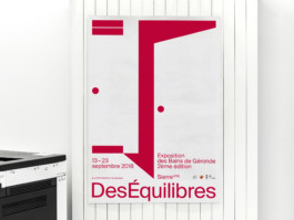
DesEquilibres
A poster I designed for an exhibition in Valais (Switzerland) about cooperation between artists from different countries in order to create a piece of art through this union. The visual of this poster is inspired by the shape of the fitting rooms of the exhibition space (The Géronde’s baths).
● Poster, (A0) 841*1189 mm
13/16
Info.
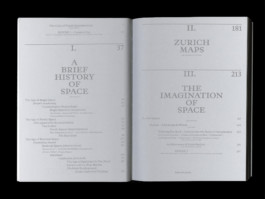
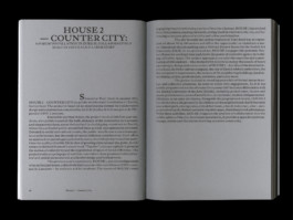
All About Space, Vol. 3: Beyond the object
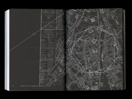
During my internship at Hubertus Design (Zürich) I had the opportunity to work on and design the third volume in a four-part series on ALICE’s teachings.
Edited by Dieter Dietz, Matthias Michel, Daniel Zamarbide and illustrated by the photographs of Dylan Perrenoud, Beyond the Object follows up on The House 1 Catalogue and The Invention of Space. This volume is proposing an alternative cultural history of architecture derived from the notion of spatial design rather than technical engineering and construction. Among the topics discussed are the common and scientific understandings of space and how they can be applied to contemporary architectural practice.
It have been made in cooperation with the Atelier de la Conception de l’Espace (ALICE), affiliated with the School of Architecture at the Ecole Polytechnique Fédérale de Lausanne. The first edition was published by Park Books in 2018 [ISBN 978-3-03860-112-8].
● Paperback, 320p. (127 b/w illustrations), 165*230 mm
14/16
Info.
Shakotan
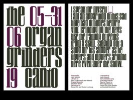
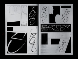
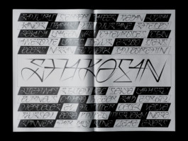
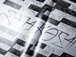
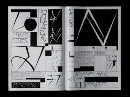
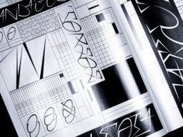
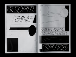
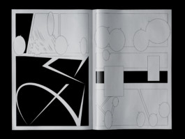
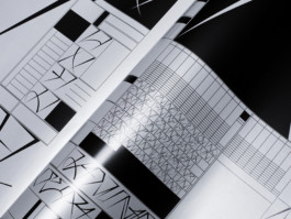
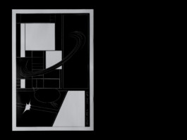
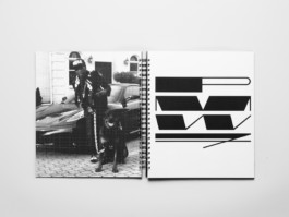
Shakotan is a lettering inspired by the japanese tuning. I used shapes inspired by curves from tuned cars, ornaments, stickers. It suggests motion and fastness. It is a versatile lettering with multiple possible variations for the same letter.
● Specimen, 315*470 mm
● Printed in Offset in two colors (Silver and Black) at Cavin (ex. 200 copies)
15/16
Info.
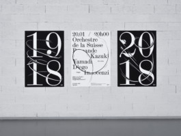
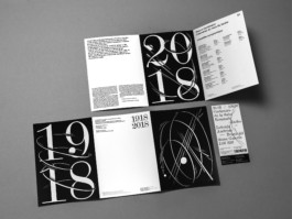
Orchestra of Romandy
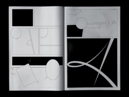
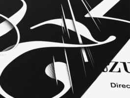
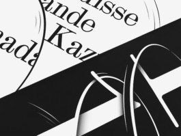
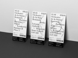
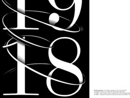
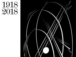
Visual identity made for the centenary of the Roman Swiss Orchestra.
This project transcribes music motion: the harmonics between different instrument chord. This universe is inspired by the world of comic books, childish and innocent confronted to the prestigious and strict sides of classical music.
● 3 posters (F4), 895*1280 mm
● Flyers, 444*210 mm
● Tickets
16/16
Info.
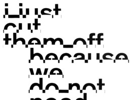
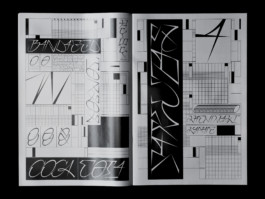
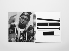
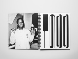
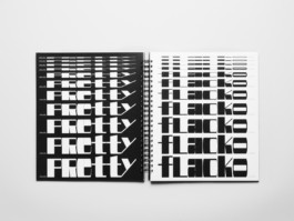
ASAP
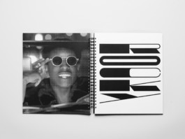
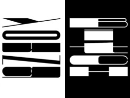
ASAP is a display typeface inspired by Hip-Hop culture.
I decided to work the letter like a graffiti and explore the limit of visibility and readability. ASAP overcomes the classic codes by thinking of a typography that is to read more in its verticality than in its horizontality.
● Specimen, 280*330 mm (116p.)
All right reserved Benoit Brun
Update 2020
GO UP!
I'm Benoit Brun, from Sanary-sur-Mer. (FR)
I am a graphic and type designer graduated from ECAL/Ecole Cantonale d'art de Lausanne. (CH)
Instagram, INFORMATIONS, CONTACT .
01/16
Info.
Karak
“I got a paper sheet, here are the scissors, let’s see how to make an ‘a.’
Okay, here we go! Let’s cut first into the sheet, there is no turning back now! It’s like a choreography. I draw a curve, then I turn my sheet and I go backwards... Wooah a shape and counter-shape game appears as if I am creating the Yin and Yang sign. Well, let’s carry on under the sound of ‘snip-snip’ until I reach my first cut. Mhm in the end this ‘a’ looks like a fat guy who leans forward and looks at his belly…”
Karak is a typeface composed of 5 styles, which are the result of an original material experimentation. This is a journey that recalls the innocence and the creative impulse of our youth days.
● Specimen, 460*650 mm
● Printed in UV at SwissGrafik
02/16
Info.
A. Hollenstein, Towards a new
free typography in France
Perceived as “French” in Switzerland and “Swiss” in France, the career of Albert Hollenstein as a typographer was the subject of my MA thesis. I aimed to show his entire path and typographic work. An art, which according to him, is capable of accompanying all social and cultural changes because it gives us the opportunity to decipher the world.
Through this writing, I came to think that Hollenstein’s adventure could be seen as an example to be remembered, to be highlighted for all the future generation of today’s graphic designers. Indeed Hollenstein dedicated his life (from the 50 to the early 70’s) to research new innovations and promote a new typography in France considered as free, imaginative, exclusive and ever more original. By constantly recruiting new collaborators – as young typographers and unknown graphic designers – Hollenstein’s team was on top of the French phototitling scene in the 70’s.
●Book, 98p., 180*270 mm
● Printed at ECAL
03/16
Info.
Neue Brasilia
After going through Albert Hollenstein’s archive and doing many researches on his life, I finally decided to make my own interpretation of the wonderful and iconic “Brasilia,” initially thought and sketched by Hollenstein and then designed and developed by his friend Albert Boton.
● Several formats and mediums
● Printed at ECAL
04/16
Info.
OBY
“OBY” is a font inspired by the univers of the Tools. It has two cuts: a strong one display version characterized by geometric elements similar to the shape of some tools and a more classic one which can be used more for “texts”.
● Specimen, 212*318 mm
● Printed at ECAL
05/16
Info.
Stencil
During a workshop lead by NORM, I spent four days working on the topic of a stencil typeface.
It results in three posters produced only by hand.
● Handmade posters (F4)
● Workshop with NORM
06/16
Info.
Tikgo
Herb Lubalin and Tony Di Spigna have designed a new typeface around 1975 for Photo. Lettering INC. that combined Gothic simplicity and Roman elegance; they called it “Serif Gothic.”
Tikgo is a reinterpretation of this iconic model which distinguishes itself by the accentuation and affirmation of its geometric properties. It exists in several cuts starting from a light – very thin with detailed and powerful serifs – to an extreme and impacting black cut. This rather modern and digital version that is “Tikgo” also offers a new reworked and extremely tighter spacing than the original.
● Poster, A0 (841*1189 mm)
● Specimen’s flyer, A4 (210*297 mm)
● Printed at ECAL
07/16
Info.
Rapid
This project is the result of a collaboration with Raphaël de la Morinerie, also graphic and type designer. We designed this typeface based on the logo of the industrial machinery firm “Rapid.”
Then we discovered that it was a forgotten typeface called “Bau” designed by Flemming Bau in 1973 and published by Mecanorma foundry the same year. Both “Bau” and “Rapid” design systems are based on a four-circle grid but do not share the same lettershape constructions.
● Newspaper, 350*500 mm
● Printed at Newspaper Club
08/16
Info.
Craft
“Craft” is a collaborative display typeface that takes shape within the framework of a visual identity proposal for a Berlin artist.
In her moodboard she shared with us her taste for wooden headline typefaces. We then attempt to grasp the essence of this typographic style by digitally working on their characteristic, which is both brutal and subtly naïve.
This project is also the result of a collaboration with Raphaël de la Morinerie.
● Letterhead, 210*297 mm
● Exhibition’s flyer, 148*210 mm
● Business card, 55*90 mm
09/16
Info.
Mirage Club
Mirage Club is a special lettering and a display typeface I developped for the ecal Show, result of a workshop led by Golgotha. The lettering was exhibited on the gallery window at 24 rue Beaubourg during ParisPhoto.
● Exhibition display for the ECAL show
● Flyer, 148*210 mm
10/16
Info.
Actuel
“Actuel” digitally reconstructs an abandonned typeface, found in one of England’s most distinguished typefoundries specimen, Stephenson, Blake and Co. The original was designed by a British type designer named Sir William Kirkwood. He punchcut Athenian (1889), Antiques Nos. 1,2,3,4 (1904), Booklet Italic (1904, design / Elisha Pechey) and the famous Windsor (1905, design / Elisha Pechey).
● Poster, A1 (594*841 mm)
● Research book, A4 (210*297 mm)
11/16
Info.
Sticky Gum
Poster protesting against sticky gum in the street. It was printed in Letterpress linocuts in 600*800 mm. This is the result of five days workshop with Dafi Kuhne at ECAL.
● Letterpress Poster, 600*800 mm
● Workshop with Dafi Kuhne

12/16
Info.
DesEquilibres
A poster I designed for an exhibition in Valais (Switzerland) about cooperation between artists from different countries in order to create a piece of art through this union. The visual of this poster is inspired by the shape of the fitting rooms of the exhibition space (The Géronde’s baths).
● Poster, (A0) 841*1189 mm
13/16
Info.
All About Space,
Vol. 3: Beyond the object
During my internship at Hubertus Design (Zürich) I had the opportunity to work on and design the third volume in a four-part series on ALICE’s teachings.
Edited by Dieter Dietz, Matthias Michel, Daniel Zamarbide and illustrated by the photographs of Dylan Perrenoud, Beyond the Object follows up on The House 1 Catalogue and The Invention of Space. This volume is proposing an alternative cultural history of architecture derived from the notion of spatial design rather than technical engineering and construction. Among the topics discussed are the common and scientific understandings of space and how they can be applied to contemporary architectural practice.
It have been made in cooperation with the Atelier de la Conception de l’Espace (ALICE), affiliated with the School of Architecture at the Ecole Polytechnique Fédérale de Lausanne. The first edition was published by Park Books in 2018 [ISBN 978-3-03860-112-8].
● Paperback, 320p. (127 b/w illustrations), 165*230 mm
14/16
Info.
Shakotan
Shakotan is a lettering inspired by the japanese tuning. I used shapes inspired by curves from tuned cars, ornaments, stickers. It suggests motion and fastness. It is a versatile lettering with multiple possible variations for the same letter.
● Specimen, 315*470 mm
● Printed in Offset with two colors (Silver and Black) at Cavin (ex. 200 copies)
15/16
Info.
Orchestra of Romandy
Visual identity made for the centenary of the Roman Swiss Orchestra.
This project transcribes music motion: the harmonics between different instrument chord. This universe is inspired by the world of comic books, childish and innocent confronted to the prestigious and strict sides of classical music.
● 3 posters (F4), 895*1280 mm
● Flyers, 444*210 mm
● Tickets
16/16
Info.
ASAP
ASAP is a display typeface inspired by Hip-Hop culture.
I decided to work the letter like a graffiti and explore the limit of visibility and readability. ASAP overcomes the classic codes by thinking of a typography that is to read more in its verticality than in its horizontality.
● Specimen, 280*330 mm (116p.)
All right reserved Benoit Brun
Update 2020
GO UP!
